Principles of Graphic Designing: Keys that Shape Every Visual
Published: 19 Feb 2026
Many people feel stuck when clients demand a professional look. They search for new fonts and colours, but their designs still feel weak. The problem is not the tool. It is the missing principles of graphic designing. When I teach these principles to students and digital earners, they suddenly fix alignment, spacing, and hierarchy.
Their visuals become more professional, and they start closing more freelance jobs without extra tools or upgrades. Now I will explain what are the principles of graphic design which help you make your designs more appealing and clickable.
Definition of Graphic Designing Principles
Graphic designing principles are the rules that guide how visual elements like text, colours, shapes, and images are arranged to make a design clear, attractive, and easy to understand. They help communicate the message effectively and make the design look professional.
Example of Principle:
The best example is to use contrast that makes a call-to-action button stand out on a website. Button uses a bright colour against a neutral background, so viewers notice it immediately.
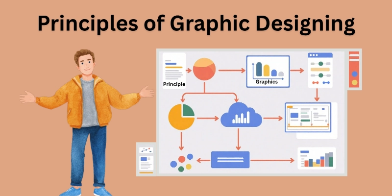
Graphic Designing Principles
Why do some visuals pull your eyes straight to the main idea? It is not by accident. It is the result of designing principles that tell the viewer where to look and what to notice first. These rules of graphic designing turn simple graphics into meaningful communication.
- Balance
- Contrast
- Hierarchy
- Alignment
- Repetition
- Proximity
- Space
- Proportion
- Emphasis
- Movement
- Rhythm
- Unity and Harmony
These fundamental principles of design lists show how important it is to know the laws of graphic designing.
1. Balance
Balance gives a design structure and calmness. When elements sit evenly, the viewer feels comfortable and focused. Balanced layouts work well for posters, ads, and brand visuals where clarity matters.
It also reduces distraction and makes the design feel intentional. This principle is a key part of any graphic designing theory.
Key Points
- Balance keeps visual elements stable and pleasing.
- Symmetrical balance creates order and professionalism.
- Asymmetrical balance creates variety and visual interest.
- Designers use balance to avoid heavy or messy layouts.
2. Contrast
Contrast makes information stand out. Designers use it to highlight titles, buttons, and key visuals without adding extra decoration. Strong contrast is common in digital ads and social designs because it helps users notice the most valuable information immediately. That is why the contrast design principle is crucial for effective visuals.
Key Points
- Contrast uses differences in colours, fonts, and sizes.
- highlights important details.
- Improves readability and visibility.
- Guides the viewer’s attention fast.
3. Hierarchy
Hierarchy tells the viewer what to read first and what to read next. It directs the viewer’s attention in the intended order and makes complex information easier to follow.
This principle helps landing pages, learning content, and product visuals communicate more clearly. Hierarchy is one of the types of principles every designer should master.
Key Points
- Hierarchy organizes information by importance.
- Viewers notice the top priority first.
- Designers use size, weight, and spacing for hierarchy.
- It reduces confusion and improves message flow.
4. Alignment
Aligned layouts feel organized and easier to scan. Designers use alignment to build a clean structure in websites, brochures, and social posts.
It improves visual discipline and saves the viewer time by reducing unnecessary searching on the screen. Alignment is a core part of basic design principles.
Key Points
- Alignment keeps elements lined up.
- Improves neatness and order.
- Removes random spacing.
- Makes layouts look professional.
5. Repetition
Repetition makes a design feel unified and consistent. Brands use it to look familiar across packaging, ads, and digital content.
This builds recognition and trust, which matters for selling products and building long-term brand memory. Repetition is a common design principle used in modern branding.
Key Points
- Repetition uses similar fonts, colours, and shapes.
- It builds consistency.
- It strengthens branding.
- Connects multiple visuals into one identity.
6. Proximity
Proximity helps viewers find information without hard effort. When related items sit close, the brain processes them faster. This principle improves product labels, menus, website layouts, and business cards because it organizes information at a glance.
Key Points
- Proximity groups similar items.
- Separates unrelated information.
- It improves reading flow.
- Reduces confusion for the viewer.
7. Space
White space is not empty. It gives the design air and importance. When used well, it improves attention and makes key elements stand out. Modern websites and product branding rely heavily on white space to look clean, simple, and elegant.
Key Points
- Space gives breathing room to elements.
- It reduces clutter.
- Improves focus and clarity.
- Modern brands use space for a premium feel.
8. Proportion
Proportion shapes how viewers judge importance in a design. When sizes match their purpose, the layout feels balanced and intentional. This principle tells storytelling in posters, YouTube thumbnails, and ad graphics by controlling visual weight.
Key Points
- Proportion manages the sizes between elements.
- Big elements feel more important.
- It creates harmony in layout.
- Designers use it to guide focus.
9. Emphasis
Emphasis directs the viewer’s attention to the main message, product, or idea. Designers often emphasize headlines, offers, or call-to-action elements in ads and digital banners. This ensures the viewer makes quick decisions, which matters in fast-scrolling digital environments.
Key Points
- Emphasis highlights the most important element.
- It tells the viewer where to look first.
- Designers use size, weight, and spacing to create emphasis.
- Improves message clarity in busy layouts.
10. Movement
Movement makes a design feel active and intentional. It leads the viewer from point A to point B in a logical order. This is strong in product pages, thumbnails, and brochures, where attention must travel smoothly from one detail to the next.
Key Points
- Movement guides the viewer’s eye through the design.
- Creates flow and storytelling.
- Designers control movement with shapes, lines, and placement.
- Tell how information gets processed.
11. Rhythm
Rhythm works like visual pacing. It repeats elements in a steady pattern to make the design feel consistent without being boring. Designers use rhythm in social carousels, print layouts, and web sections to create visual flow and balance.
Key Points
- Rhythm uses visual patterns to create repetition with variation.
- Adds structure and predictability.
- keeps the viewer engaged.
- Supports modern layouts and brand visuals.
12. Unity and Harmony
Unity and harmony make the entire design feel whole. Colours, typography, spacing, and imagery must support the same message and tone. When these parts connect smoothly, the design becomes easier to trust, easier to remember, and more effective for branding and marketing.
Key Points
- Unity joins different elements into one complete visual.
- Harmony ensures those elements feel like they belong together.
- Both principles improve professionalism.
- They help brands build strong visual identities.
When you apply these 12 design elements in your design work with purpose, capture attention and tell a clear story, making your visuals more powerful and professional. However, the question here is how these principles work together.
How Do Graphic Principles Work Together?
See how all the design principles connect to make every element purposeful. Using them together turns ordinary visuals into clear, professional, and engaging designs.
- Start with balance and alignment to keep the layout stable and organized.
- Add contrast and hierarchy to guide the viewer’s attention to the most important elements first.
- Use proximity and repetition to group related items and build consistency.
- Leave enough space and apply proper proportion to make the design feel clean and harmonious.
- When these principles work in combination, they turn simple visuals into professional, clear, and engaging designs that communicate the message instantly.
Conclusion
The principles of graphic designing are the foundation of every great visual that we have seen in this blog. I suggest using them consciously in your daily projects; even simple adjustments in balance, contrast, or spacing can make a huge difference.
I appreciate your time and attention while going through this guide. Wishing you success in applying these principles. Explore the next FAQ section carefully; you will likely find more interesting facts. Do not ignore it, as missing it could cost you new knowledge!
FAQs
These frequently asked questions about graphic design principles provide additional information and help us in our graphic design careers.
The basic principles of graphic designing are arranging text, images, and shapes in a visually appealing way. They include balance, contrast, hierarchy, alignment, repetition, proximity, space, proportion, emphasis, movement, rhythm, and unity. Using these principles makes your designs clear, professional, and effective for digital content, ads, or social media visuals.
These are the best instructions
- Start by planning your layout and deciding what the viewer should notice first.
- Use balance and alignment for structure, contrast and hierarchy to guide attention, and repetition and proximity to keep related items connected.
- Applying these principles together ensures your visuals look organized, professional, and easy to understand.
It means referring to guidelines that help you organize visual elements so the design communicates clearly. These principles make your work easier for the viewer to read and understand. Following them can turn ordinary graphics into professional, eye-catching visuals.
Yes! Using principles like contrast, hierarchy, and emphasis can make titles, thumbnails, and call-to-action buttons stand out. Proper balance, spacing, and repetition keep your posts clean and consistent. This makes your social media content more engaging and increases clicks, likes, and shares.
Many principles apply across industries, but some adapt depending on the medium. For example, principles of design in fashion focus on texture, proportion, and colour harmony, while graphic design emphasizes hierarchy, contrast, and spacing. The core idea is always the same: guide attention, create balance, and communicate clearly.
Not necessarily. You can start with simple tools like Canva, Figma, or Adobe Illustrator. What matters most is understanding how balance, contrast, alignment, and other principles work and applying them consistently in your designs.
Understanding the principles helps you create professional visuals that attract clients and viewers. Mastery of these principles can make your portfolio stand out and increase opportunities for earning online.


- Be Respectful
- Stay Relevant
- Stay Positive
- True Feedback
- Encourage Discussion
- Avoid Spamming
- No Fake News
- Don't Copy-Paste
- No Personal Attacks
- Be Respectful
- Stay Relevant
- Stay Positive
- True Feedback
- Encourage Discussion
- Avoid Spamming
- No Fake News
- Don't Copy-Paste
- No Personal Attacks
